How to Make Text Work on Different Ads
From Facebook ads to brochures, there are a lot of ways to get your marketing message out into the world. Many design concepts will translate across all types of advertising, but making some minor tweaks across each ad type can take you from white noise to eye-catching ads that convert.
One easy way to take your ad from drab to fab is to pay attention to your copy use and font choices. Text size and style, text-to-image ratio, and color choice can each make a difference to your ad’s success. Listed below are a few guidelines that apply to each ad type as well as minor tweaks you can make based on your preferred advertising platforms.
Text Guidelines for All Ads
Any type of ad will be far more effective if you have a simple message stated in clear terms despite the message length. Your design elements should then serve to support both the purpose and the clarity of your message. Of course that includes your images and colors schemes, but it should also include your font choice and use. When you’re choosing fonts for any type of ad, start with these general considerations:
Match the scope of your organization.Choose font types and colors that match the overall purpose of your company (as well as the message of each ad).
Stay on brand. Use the same one or two fonts throughout all your branding and advertising so customers will more easily recognize your brand.
Use contrast for pop. Choose a text color that’s in high contrast to the background of your ad. Good contrast is eye-catching and it increases readability.
Text Guidelines for Facebook Ads
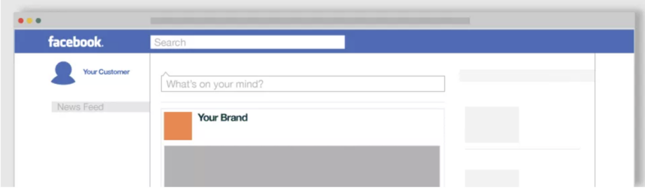
For Facebook ads and other digital ads, take on a “less is more” attitude. People scroll quickly through their newsfeeds, so it’s important to grab their attention just as quickly. To get those clicks and conversions, it’s key to use an excessively clear design and message. Here’s how your copy and font use can help.
Use one or two fonts only. Fonts competing for attention will detract from your message and may even add confusion.
Make your text and colors pop. Use text colors that are complementary to the rest of your ad but still have high contrast. Your text color should match and pop at the same time for visual harmony and readability.
K.I.S.S. your ad. “Keep it simple…sweetheart” is the keystone for successful ad messaging. Use only the copy you need to convey the main purpose or hook of the ad, whether it’s a sale, product feature, or blog post.
Use the 20% rule. According to Facebook’s research, consumers prefer and are more likely to click on ads that use a ratio of 20 percent text or less.Text Guidelines for Billboard Ads
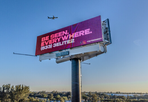
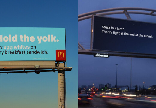
Text Guidelines for Billboard Ads

With billboards, your copy and text considerations all have to do with speed. Drivers only have a few seconds to interact with your ad, so your message must be incredibly concise and clear. In fact, text and font choices may be more important on billboards than any other type of advertising. See some tips below, and click here for more.
Use five to seven words. You’ll need to hammer down to the heart of your message, but it’s worth it. Studies show that most people stop reading billboard ads at around five words.
Choose fonts that pack a punch. This doesn’t mean cutesy and clever fonts. Rather it’s best to choose a font that is weighty and easy to read. Cursive scripts and narrow lettering are the hardest fonts to read on a billboard and should be avoided.
Create high contrast. You can’t read what you can’t see, especially when you’re traveling down a highway. Crisp color contrast will make your text pop.
Skip the fine print. The information will get lost and may even detract from the main purpose of your ad. Save the fine print for your brochures and website.
Text Guidelines for Flyers

One of the main challenges with flyers is using your space wisely. Since you have a lot more room for a design, it’s tempting to cram in too much information and fiddly design elements you don’t need. As with any ad, it’s still important to keep your main message the focus. These font use ideas will help keep you on track.
Use two fonts.Make sure the fonts are very different from one another and use them to create a hierarchy of information on the flyer. The largest text on the flyer signals that it’s the most important information on the page (AKA it’s your main message).
Create one, eye-catching focal point. This can be an image, but you can also create a focal point with text using text size, color, and alignment.
Align text with a purpose. If all your text is center aligned, it’s more difficult to read; people are used to having a hard left line to signal where the text begins. Play with your alignment to find readability and visual balance.
Focus on the main message (mostly). Even though you have more space, it’s still important to focus on the main message. However, it’s OK to add one or two details that will help the consumer understand and interact with your event or product.
Text Guidelines for Brochures
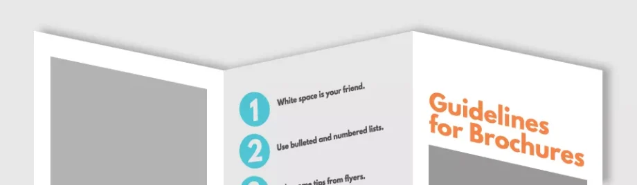
By now you may have noticed an advertising theme: convey your message with as few words as possible. Even though you get to say a lot more on a brochure, using as little text as possible while serving up your message is still a good idea. The copy should all still point toward your main message otherwise it’s a distraction rather than useful information. Check out a few tips below then click here for more.
Remember that white space is your friend. Yes, you have a lot of space, but it should not be packed to the gills with text. Big blocks of text are harder to read, especially in a brochure which typically use eight- or nine-point font. Add a little extra space between each paragraph and don’t crowd images.
Use bulleted and numbered lists. Lists are the easiest way to cut down on text while saying a lot. As a bonus, well-formatted lists inherently have a lot of needed white space.
Take some tips from flyers. Just as with flyers, stick to two fonts and use high color contrast and point size to create a hierarchy of information.