Billboards only work if people notice them – and that starts with design. A sharp, clear message paired with bold visuals can turn a passing glance into real results. These days, billboard advertising isn’t just for national brands with giant budgets.
Digital billboard platforms have opened the door for local businesses to launch campaigns with flexibility and low upfront costs.
This guide will walk you through exactly how to design a billboard that gets noticed and remembered. You’ll learn how to structure your layout, choose effective colors and fonts, and use popular tools to bring your concept to life.
Once you’ve nailed your design, we’ll show you how to test it the smart way using Blip’s digital billboards, which offer affordable pricing, no long-term contracts, and no minimum ad spend, along with built-in tools to support your creative process. Let’s find out how to design a billboard.
Key Takeaways
- Viewing time at highway speeds is six to eight seconds, so text must be legible from 200 feet away with minimal words and high contrast.
- The surrounding environment influences color choices; saturated hues hold up better under changing light and weather.
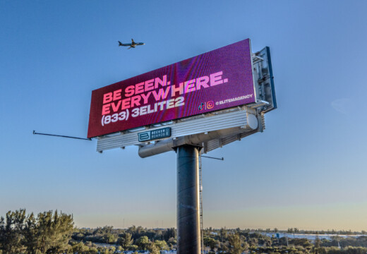
- A clear hierarchy of two to six words guides the eye: headline first, supporting visual next, logo and CTA last.
- Photoshop requires 10% safe-zone margins and organized layers; Canva offers fast templates but limited precision.
- Illustrator’s vectors scale infinitely, let you outline text to prevent font issues, and export multiple formats from one master file.
- Test designs with the squint test, mockups, and three-second feedback, then launch instantly using Blip’s flexible digital billboards.
Run your digital billboard campaign on your terms with Blip. No contracts, no commitments – just full self-serve control to start, stop, and scale your ads whenever you need.
What Three Factors Do You Need to Consider When Designing a Billboard?
Billboard design is about getting seen, read, and remembered. To do that, your creative needs to account for speed, environment, and how the message is delivered at a glance.
Here’s how those three factors work together.
Viewing Distance and Speed
Billboards operate on a completely different timeline than other media. At 60 mph, drivers have about six to eight seconds to view your sign – roughly 200 feet of visibility. That’s all the time you get to communicate your message, make an impression, and prompt a next step.
To make that happen, your text must be legible from a distance. Use large fonts, high contrast, and minimal wording. Avoid fine detail, low-saturation colors, or busy graphics. A billboard should function like a moving elevator pitch: short, punchy, and crystal clear.
Environmental Context
Your design needs to stand out in unpredictable conditions. City lights, sunsets, overcast skies, or competing ads nearby can all impact visibility. A bright orange may look great indoors, but fade into the horizon outdoors.
Design with context in mind. Use bold, saturated colors that hold up in full daylight. Avoid fine gradients that disappear in fog or rain. The goal is consistency. Your message should stand out at noon, at dusk, and during a morning traffic jam in the rain.
Message Hierarchy
Not every word deserves equal space. The best billboard designs establish a clear visual hierarchy so the viewer knows where to look first and what to remember.
Stick to a single core message, ideally within two to six words.
Pair it with a simple visual or icon that reinforces the text. Your logo or business name should be visible but secondary. A subtle call-to-action (CTA) is optional, but if included, it must be short and easy to process. The design should guide the eye from start to finish in one smooth pass.
Get started on your own terms with Blip’s flexible digital billboard campaigns. Enjoy full self-serve control, stop or scale anytime, and track results with 24-hour performance reports.
Billboard Size Standards for Design Software
Before opening your design software, it’s worth knowing the size and resolution standards used in the billboard industry. Print and digital billboards follow different specifications, and working with the correct format from the beginning can save you from time-consuming rework later.
Print Billboard Dimensions
Traditional billboards follow set physical dimensions. The most common is the bulletin, which measures 14 feet high by 48 feet wide.
Smaller junior posters are typically 10.5 feet by 36 feet. For print designs, professional designers work at 300 DPI to maintain sharpness at large scales.
Since this can produce extremely large files, most designers scale their artwork to 14 by 48 inches at 300 DPI and allow the print service to enlarge it to full size.
Digital Billboard Resolutions
Digital billboards use pixel-based resolutions, and aspect ratios can vary by provider. Common formats include 16:9, 3:1, and 4:1. These displays typically require much lower resolution than print, usually between 72 and 150 DPI, since they are viewed from a distance.
For example, Blip’s digital billboard network informs users of the correct dimensions to use for any given billboard, optimizing the resolution for standard HD display settings. This allows for efficient file handling without sacrificing visual impact at full scale.
Always Confirm Provider Specs
Before you finalize any billboard design, confirm the required specifications with your media provider. Some platforms require specific file types, aspect ratios, or safety margins for text. A quick check at the beginning can prevent major issues later in production.
For more information, read our in-depth guide on billboard sizes.
How to Design a Billboard in Photoshop
Photoshop remains a top choice for billboard design, offering full control over layout, typography, and visual layering. Below, we’ll walk through how to set up your document, maintain proper formatting, and export your files for real-world digital billboard use.
Setting Up Your Billboard Template
Before diving into design, you need the right file structure. These are the specs and setup steps required for digital billboard artwork.
Create the Document
- Open Photoshop and go to File > New
- Set the dimensions to 1920 x 1080 pixels (16:9 ratio)
- Choose RGB color mode
- Set resolution to 72 DPI (ideal for digital displays)
Higher resolution won’t improve screen clarity and only bloats file size unnecessarily.
Add Safe Margins
To ensure important content doesn’t get cropped:
- Go to View > New Guide Layout
- Add 10% margins on all four sides
This margin zone protects your headline, logo, and CTA from being lost due to display variations.
Organizing Design Layers
A clean layer structure keeps your workflow efficient and adaptable.
Recommended Layer Structure
- Background Layer: Use solid colors or high-contrast imagery
- Text Layers: Separate layers for headlines and supporting copy
- Logo Layer: Keep it separate for easy resizing or swapping
- Adjustment Layers: Apply color grading or brightness edits non-destructively
Organized layers make revisions and versioning easier across different ad placements.
Photoshop Design Best Practices
Once your canvas is ready, focus on the billboard-specific visual principles that make designs readable and compelling from a distance.
Typography That Stands Out
Billboards must be legible at a glance, even at 70 mph.
Font Selection and Sizing
- Use sans-serif fonts like Montserrat, Helvetica, or Arial
- Set headline size to 200 points or larger
- Apply drop shadows or outlines to boost contrast
Test legibility by zooming out to 10% view. If it’s unreadable at that scale, it won’t work on the highway.
Color Optimization and Contrast
Readable colors require thoughtful contrast – not just bright hues.
Best Color Practices
- Stick with RGB mode to access full display color ranges
- Use color contrast tools or plugins to ensure readability
- Avoid pure white; instead, use 95% white to reduce digital glare
- Test in grayscale mode to confirm sufficient contrast independent of color
Exporting for Billboard Display
When your design is complete, export high-quality versions for display partners.
File Formats and Settings
- Use JPEG for photo-heavy designs
- Use PNG if transparency is needed
- Set export quality to maximum
- Name files clearly
Save multiple versions if you’re designing for billboards with different specs or orientations.
How to Design a Billboard in Canva
Canva makes billboard design accessible for businesses without a graphic design background. While it doesn’t offer the deep control of Photoshop, it’s ideal for fast execution, affordable campaigns, and teams working without professional design software.
Can I Design a Billboard in Canva?
Yes, you can. Canva includes everything you need to build a clean, effective billboard – just with a few limitations. Its drag-and-drop interface and ready-made assets allow you to get a working billboard up in less than an hour.
Start With the Right Canvas Size
Select Create a Design > Custom Size and choose dimensions that match the aspect ratio of the digital billboard you’ll be using.
The standard 16:9 widescreen (1920 x 1080 pixels) works for many boards, but other ratios are also common: 4:3 for older or smaller displays, 1:1 for square screens, 9:16 for portrait displays, and wider custom formats such as 3.5:1, 4:1, or 21:9 for panoramic boards.
If you’re unsure, self-serve platforms like Blip recommend the correct dimensions automatically, so your design fits each billboard perfectly.
Use Templates Strategically
While Canva offers billboard templates, creating your own design from scratch often leads to stronger branding. Templates can be helpful, but your business benefits more from standing out than blending in.
Using Canva’s Design Tools Effectively
To make the most of Canva, focus on bold visuals, simple messaging, and brand consistency.
Access the Design Library
- Use Canva Elements to search for photos, illustrations, or icons
- Prioritize high-contrast images with clear subjects
- Avoid cluttered backgrounds or over-detailed graphics
Upload your logos and product images to ensure visual consistency across your campaign. If you have a Brand Kit set up, Canva will automatically apply your fonts and colors.
Keep Text Simple and Readable
- Stick to one main message using a single text box
- Limit words to your core offer or slogan (around two to six words max)
- Use snap-to guides to align text and images for balance
When adding logos, always upload transparent PNGs to avoid unwanted white backgrounds that could interfere with your design.
Canva Billboard Design Limitations
Canva’s simplicity comes with a few trade-offs. Knowing where it falls short helps you avoid frustration or production issues later.
Font and Color Customization Limits
Canva doesn’t allow kerning adjustments or custom text effects. You are limited to the spacing and shadow presets built into the platform. Likewise, while you can enter hex codes, exact brand color matching may be inconsistent due to how Canva handles file exports and rendering.
Export Options and Resolution Concerns
Billboard designs created in Canva export primarily in JPEG and PNG formats. While this is fine for digital screens, print billboard vendors may require vector files or higher-resolution exports, which Canva does not support directly.
If your campaign needs scalable artwork or precise color correction, Photoshop or Illustrator may be better suited for the job.
When Canva Makes Sense for Billboard Design
For small businesses, solo marketers, or those testing billboard campaigns for the first time, Canva offers a solid entry point. Its user-friendly tools and low barrier to entry help you build fast, consistent ads with minimal overhead.
Businesses running recurring outdoor campaigns or needing consistent brand presentation across multiple platforms may benefit from investing in professional-grade tools or hiring a designer for polish and precision.
How to Design a Billboard in Illustrator
Adobe Illustrator is ideal for billboard design because its vector graphics stay crisp at any size. These scalable files prevent pixelation on both large printed bulletins and roadside digital screens. A single logo originally created for a business card will retain perfect clarity on a 48-foot billboard.
Set Up Your Illustrator Document
Before adding content, configure your file to match billboard specifications. This step avoids resizing errors later.
Create the Base Document
Open File > New and set up your canvas to match the aspect ratio of the digital billboard where your ad will run. Digital billboards use a variety of aspect ratios, and selecting the right one from the start ensures your creative displays correctly without distortion.
Common aspect ratios include 16:9 (widescreen), which is the modern standard for high-definition content, 4:3 for older or smaller displays, 1:1 for square boards, and 9:16 for portrait-oriented screens often found at retail entrances. Larger digital billboards frequently use custom wide formats like 3.5:1, 4:1, or even ultra-wide 21:9, creating panoramic, immersive visuals designed for high-impact exposure.
If you’re unsure which ratio to choose, digital self-serve platforms such as Blip simplify the process by recommending the appropriate dimensions for each specific board. Always work in RGB color mode for digital output and set Raster Effects to High at 300 ppi to maintain sharpness.
Configure Multiple Artboards
For campaign variations such as location-specific copy or seasonal messages, use the Artboard tool to add separate artboards. Apply the same dimensions to each one for consistency and simplify batch exporting.
Guide Your Layout with Rulers and Smart Guides
Activate View > Rulers and View > Smart Guides to position elements precisely. These tools help you align text, logos, and images without guessing.
Take Advantage of Vector Graphics
Every shape, line, and letter in Illustrator is defined by mathematical instructions rather than pixels. This means file sizes remain small even as your design scales to massive dimensions. You can adjust or refine artwork at any time without losing quality.
Apply Billboard-Specific Techniques
Once your document is ready and you understand the vector edge, use these practices to ensure your billboard reads well from a distance.
Prepare Text for Large-Scale Display
Keep text editable while you refine messaging. When you finalize a copy, select Type > Create Outlines to convert it into shapes. This prevents font substitution on another system and lets you tweak individual letters.
Manage Color for Maximum Contrast
Open the Color Guide panel to generate palettes that work against urban or natural backdrops. Use global swatches so a single update changes every instance of a brand hue. Test your design in grayscale view to confirm that contrast remains strong without relying on color alone.
Export the Correct File Formats
For print bulletins, save as a PDF to preserve vector clarity at full size. For digital screens, export PNGs or high-quality JPEGs at the document’s native resolution. You can also create SVG files for web mockups that need responsive scaling.
Get started with Blip’s flexible digital billboard campaigns. Take full control to start, pause, or scale anytime and see your message in action with instant campaign data.
How to Make a Design for a Billboard: Core Principles
Effective billboard design relies on a few consistent principles that apply no matter which software you use. These guidelines help you create ads that viewers can process in just a few seconds.
Embrace White Space
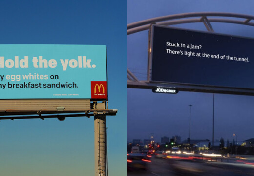
Cluttered layouts overwhelm drivers and obscure your message. White space, which may use color or background imagery, gives elements room to stand out. Aim for at least 40% of your design to be empty space. This may feel wasteful, but clear, focused messaging delivers a stronger impact than trying to fit everything onto one board.
Design for Glance Value
Today’s drivers have mere seconds to absorb a billboard. Choose imagery that communicates instantly and use a headline of no more than six words. After a quick look, a viewer should recall your core message and brand name. Test this by showing your design for three seconds, then asking for key takeaways.
Consider the Competition
Your billboard appears alongside signs, buildings, and natural features. Visit the site or view street-level photos to note common colors and design styles. If most local boards use photography, try vector art or bold typography. Standing out against the surroundings ensures your ad captures attention.
Make It Memorable, Not Just Visible
Visibility draws eyes, but memorability drives action. Select one emotional hook, such as humor, surprise, or appetite appeal, and build your design around it. A coffee shop might show a single steaming cup rather than list every menu item. That clear impression will stay with viewers far longer than a detailed pitch.
Maintain Brand Consistency
Consistency builds recognition. Use your official colors, fonts, and logo placement across all billboard variations. This cohesion helps viewers link disparate ads to your brand. Include a small, legible logo in the safe zone so that even a brief glance reinforces your identity.
Each of these principles helps you craft a billboard that communicates clearly, stands out in context, and leaves viewers with a lasting impression.
Testing Your Billboard Design
Evaluating your design before booking space saves time and money. Effective testing methods reveal issues that only appear in context.
Perform the Squint Test
Squinting at your design simulates distant viewing. If your headline or logo vanishes under blurred vision, viewers will miss it at highway speeds. Key elements must remain identifiable through squinted eyes.
Use Digital Mockups
Place your artwork on real billboard photos to see how it interacts with its surroundings. Check visibility against urban backdrops, greenery, or bright skies. These mockups help you spot contrast issues and color washout before production begins.
Gather Quick Feedback
Show the mockup to people in your target market for exactly three seconds. Then ask them to repeat your main message. Focus on recall, not personal taste. If test viewers cannot remember your core offer and brand, revise your design.
Launch your Blip digital billboard campaign today with complete flexibility. Start, stop, or scale on your schedule and measure success with live campaign insights.
Common Billboard Design Mistakes to Avoid
Learning from past failures helps you create more effective ads. The following errors occur most often.
Overloaded Information
Listing every service, phone number, and website link overloads drivers. Present one clear benefit and a simple call to action. Prompt viewers to seek more information rather than cram it into the board.
Illegible Typography
Fonts that look elegant in print often fail at a distance. Thin or script styles blend into busy backgrounds. Choose sturdy, sans serif typefaces sized for clear readability from at least 200 feet away.
Ignoring Vendor Specifications
Each billboard operator sets unique file requirements, from dimensions to color profiles. Starting design without these details risks wasted effort and unexpected display errors. Always confirm specifications before you begin.
Maximizing Your Billboard Design Investment
Strong design earns attention; strategic planning turns that attention into results. The following tactics help you get the most from your advertising spend.
Maintain Brand Consistency
Carry your billboard’s visual style into all marketing channels. Match colors, logos, and tone in social media posts, email campaigns, and website landing pages. This seamless experience reinforces brand recall and strengthens the connection between a passerby’s roadside glance and your broader outreach.
Plan for Iteration and Scheduling
Build flexible templates that let you swap headlines or images each season. In addition, schedule your ads to run during peak traffic times or special events in your area.
For example, a restaurant might focus on morning commutes with breakfast offers, then switch to dinner promotions later in the day. Regular updates prevent ad fatigue and keep your message relevant.
Use Geographic Targeting
Digital billboards let you tailor messages to specific locations or neighborhoods. Promote local store openings on boards nearby or highlight regional offers where they matter most. This precise targeting reduces wasted impressions and increases the chance that viewers will convert to customers.
Track and Test Results
Assign unique URLs or promo codes to each billboard to measure response rates. Compare performance data across locations and time frames. Tie ad placements to sales figures, foot traffic metrics, or online engagement. This data-driven approach turns conjecture into actionable insights and directs budget toward the highest-performing designs.
Learn more about the five metrics for evaluating billboard success.
Optimize Budget Allocation
Review your performance data regularly and shift spend to boards that deliver the best ROI. You can pause underperforming ads, extend high-impact runs, or adjust creative elements based on real-world results. This continuous refinement ensures each dollar invested works harder.
Ready to Launch Your Billboard Campaign?
Designing an effective billboard combines clear messaging, smart layout, and the right tools. You must factor in viewing distance and speed, environmental context, and message hierarchy to grab attention in just seconds.
Choosing correct dimensions and resolutions in design software prevents production headaches, while testing methods like the squint test and digital mockups reveal real-world issues before launch.
Consistency across your brand, iterative updates, and data-driven analysis keep campaigns fresh and productive. With these guidelines, crafting memorable, high-impact billboards becomes a predictable process rather than guesswork.
With Blip Billboards, you can upload your design and go live today. No waiting for approvals, no minimum contracts, just your message on digital billboards reaching your ideal customers.
Ready to see what billboard advertising can do for your business? Start your campaign with Blip and get your message in front of thousands of potential customers.
Frequently Asked Questions
What File Formats Work Best for Digital Billboards?
Most digital networks accept JPEG and PNG files. JPEG suits photo-rich designs, while PNG handles transparency cleanly. Always confirm your provider’s preferred formats and color profiles before final export to avoid last-minute issues in display.
How Do I Ensure Text Readability at 200 Feet?
Choose large sans-serif fonts sized for distance – headlines at 200 pt or larger in Photoshop. Use bold outlines or drop shadows to separate text from backgrounds. Test legibility by zooming out to 10% view on your screen; if it disappears there, drivers won’t read it at speed either.
Can I Use Complex Images on a Billboard?
Avoid overly detailed photos that lose clarity when viewed briefly. Opt for simple, high-contrast visuals that convey your message instantly. If you need a product shot, isolate it against a solid or subtly textured background so it remains recognizable in under three seconds.
What is the Ideal Word Count for a Billboard Headline?
Aim for two to six words maximum. This forces you to focus on the core value proposition and prevents information overload. A concise headline paired with a single supporting graphic helps drivers process your message before they pass by.
How Should I Test My Billboard Before Launch?
Start with the squint test to simulate distance viewing and identify weak hierarchy. Then place your design in digital mockups of real locations to check contrast against surroundings. Finally, show it to target-market peers for exactly three seconds and record what they recall. Revise any element that fails these tests.