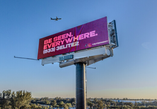
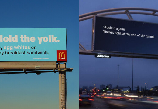
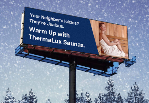
The right font can make or break your billboard. Drivers only have a few seconds to read your message, so bold, clear, and simple fonts are key. Here’s a quick summary of the best fonts for billboard ads in 2025:
Top Fonts for Billboards:
- Helvetica Bold: Clean, consistent, and easy to read.
- Arial Black: Bold strokes and wide spacing for clarity.
- Futura Bold: Modern, geometric shapes with strong visibility.
- Impact: Extremely bold for short, punchy messages.
- Trajan Pro: Sophisticated serif font for luxury campaigns.
- Rockwell Bold: Sturdy slab serif with excellent readability.
- Bebas Neue: Condensed, uppercase font for space efficiency.
- Montserrat Black: Bold and geometric for standout headlines.
- Verdana Bold: Great for digital billboards with clear spacing.
- Roboto Black: Geometric and legible for quick readability.
Key Tips for Effective Billboard Fonts:
- Keep it short: 5–7 words max.
- Use high contrast: Light text on dark backgrounds or vice versa.
- Go bold: Thick, heavy fonts are easier to read.
- Test your design: Platforms like Blip let you preview fonts on real billboards.
For a quick comparison of these fonts, their features, and best uses, check out the table below.
Quick Comparison Table:
| Font Name | Key Features | Best Uses |
|---|---|---|
| Helvetica Bold | Clean, bold, open counter spaces | General billboard messages |
| Arial Black | Bold strokes, spacious characters | Short, impactful statements |
| Futura Bold | Geometric, modern, strong spacing | Brand names, modern campaigns |
| Impact | Extremely bold, high contrast | Punchy, concise messages |
| Trajan Pro | Elegant serif, Roman style | Luxury and upscale brands |
| Rockwell Bold | Slab serif, uniform stroke weight | Bold headlines, minimal text |
| Bebas Neue | Condensed, uppercase letters | Space-efficient, large-scale ads |
| Montserrat Black | Bold, geometric design | Headlines, calls-to-action |
| Verdana Bold | Bold, generous spacing | Digital billboards, longer text |
| Roboto Black | Bold, geometric, scalable | Corporate and local campaigns |
Choose the right font and follow these tips to make your billboard impossible to miss.
The Psychology of Fonts | Fonts That Evoke Emotion
1. Helvetica Bold
Helvetica Bold is a popular choice for billboard advertising because it’s easy to read, even from a distance. Its clean design and bold weight make messages stand out, whether on busy highways or city streets.
Here’s what makes Helvetica Bold work so well:
- Consistent stroke width: This ensures every character is equally visible.
- Open counter spaces: These improve letter recognition at a glance.
- Prominent x-height: This enhances readability for both uppercase and lowercase letters.
When paired with high-contrast colors, Helvetica Bold ensures your message grabs attention, even in quick, fleeting moments.
2. Arial Black
Arial Black stands out with bold strokes and generous spacing, making it easy to read on highways and in busy urban areas. Its straightforward letter shapes allow viewers to process information quickly.
Here’s why Arial Black works so well for billboards:
- Bold strokes: The thick lines ensure your message grabs attention.
- Spacious characters: Wide spacing makes it easier to read from a distance.
- Simple design: Clean shapes help viewers absorb the message instantly.
When using Arial Black, ensure there’s enough spacing between letters and lines to avoid a cramped look. Its boldness keeps it legible even at smaller sizes – perfect for billboard designs.
Pair this font with high-contrast colors to improve visibility. Since drivers typically have time to read only about five words, Arial Black’s clarity makes it a smart choice for short, impactful messages.
Tips for using Arial Black effectively on billboards:
- Stick to short messages: Limit your text to 3–5 words for better retention.
- Choose contrasting colors: Use bold background colors that enhance the font’s readability.
3. Futura Bold
Futura Bold is a standout choice when you need a bold, easy-to-read font. This sans-serif typeface combines a sleek, modern look with excellent readability – perfect for grabbing attention fast.
Here’s what makes Futura Bold effective:
- Geometric shapes: Built from circles and straight lines for a clean, balanced look.
- Consistent stroke weights: Ensures uniformity across all characters.
- Generous spacing: Prevents letters from feeling cramped.
- Strong vertical elements: Boosts visibility and makes text pop.
Tips for Using Futura Bold
- Keep messages concise – aim for no more than 7 words.
- Use ample spacing to keep the text clear and distinct.
- Pair with contrasting background colors to enhance visibility.
- Avoid condensed versions, as they can compromise clarity.
Futura Bold works well across various billboard applications. It’s especially useful for brand names, short promotional messages, calls-to-action, and announcements with tight deadlines. By following these tips, you can make the most of Futura Bold’s clean and striking design to create ads that get noticed.
4. Impact
Impact is a bold sans-serif font that’s perfect for billboard advertising. Its thick, strong letters make it easy to read and grab attention instantly.
Key Feature:
- Extremely bold character weight.
How to Use Impact Effectively:
- Keep It Short: Stick to 5 words or fewer. Impact works best with concise, punchy messages that maximize its bold design.
- High Contrast: Use strong color contrasts. Instead of pure white, opt for slightly darker shades like RGB 235,235,235 or deeper tones for better visibility.
Design Tips:
Impact shines when you need to establish a clear visual hierarchy and ensure readability from a distance. It’s ideal for short, striking messages. For balance, pair it with simpler fonts for supporting text.
This font is especially useful for digital billboards, as it stays clear and readable even under different lighting conditions.
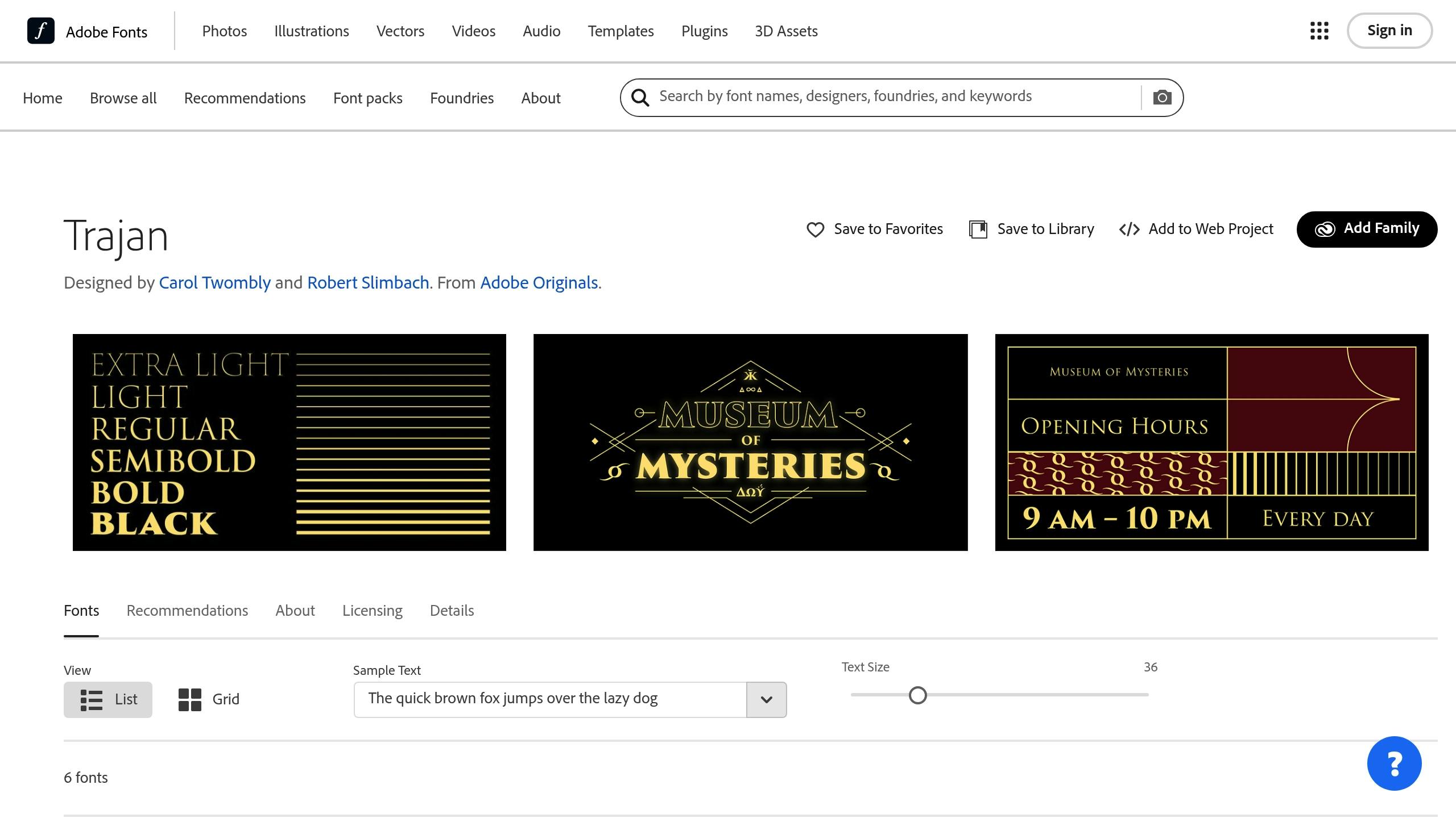
5. Trajan Pro

Trajan Pro brings a touch of sophistication and timeless appeal, making it a great choice for upscale brands. While bold sans-serif fonts dominate many designs, this serif option stands out for premium billboard campaigns.
This font features Roman-style letterforms that exude elegance and authority, making it a favorite for luxury brands and high-end marketing efforts.
Key Features:
- Roman-inspired capital letterforms
- Strong vertical lines for a commanding look
- Excellent readability, especially at larger sizes
Best Uses:
- Luxury real estate promotions
- High-end retail campaigns
- Premium car advertisements
- Cultural institution displays
- Entertainment branding
Design Tips:
- Keep your message short – 5 words or less – for easy readability.
- Use large font sizes to ensure visibility from a distance.
- Pair the font with high-contrast, bright color schemes.
- Stick to solid backgrounds to highlight its classic design.
- Add generous spacing between letters for a polished look.
- Avoid excessive decorative elements that might clash with its elegant style.
- Ensure the font remains clear in both daytime and nighttime settings.
Trajan Pro’s refined look is perfect for campaigns where elegance and brand image are key. However, its detailed design needs careful handling – pay close attention to spacing and size to ensure it stays legible for viewers on the move.
6. Rockwell Bold
Rockwell Bold is a slab serif font known for its strong and striking appearance. Its squared serifs and bold letterforms make it stand out, ensuring your message grabs attention.
Key Features:
- Geometric serifs that enhance visibility
- Uniform stroke weight for clear readability
- Easy to read from a distance
- Works well even with minimal text
Tips for Billboard Use:
- Make the font size large enough for distant viewing
- Pair it with high-contrast colors, like black on white
- Keep text short – ideally no more than 7 words
When combined with a high-contrast background, Rockwell Bold delivers your message clearly and effectively. Its solid design and focus on readability make it a dependable option for billboard ads in 2025.
Up next, discover another font that makes an impact on billboards.
sbb-itb-2e2e93f
7. Bebas Neue

Bebas Neue is a condensed, all-uppercase sans-serif font that’s perfect for billboard ads. Its design makes the most of limited space while delivering a bold and impactful look.
Key Features:
- Uppercase-only letters
- Condensed shapes to save space
- Bold, even strokes for easy reading
- Balanced weight across all characters
Best Practices for Use: Bebas Neue prioritizes clarity and impact, making it ideal for large-scale designs. Its condensed style works best when used at larger sizes. For billboard ads:
- Limit your message to 5 words or fewer
- Use high-contrast text and background colors
- Ensure proper spacing between letters for readability
Color and Contrast: Pair Bebas Neue with strong, contrasting colors – like dark text on a light background or vice versa – to highlight its bold design.
Why It Works for Billboards: Bebas Neue’s clean, straightforward layout ensures quick readability, even at a glance. This makes it a great choice for digital billboards, where your audience only has seconds to absorb your message. For URLs, if your web address matches your business name, there’s no need to repeat it – one mention is enough.
Its bold, structured style ensures your message stands out, even with brief exposure.
8. Montserrat Black
Montserrat Black is a bold, sans-serif font that grabs attention, making it perfect for billboards. Its geometric design ensures messages are easy to read, even at a glance.
Keep your text short – around 7 words – to make the most of its bold impact. Pair it with high-contrast colors and a clean layout to highlight headlines, company names, or calls-to-action. This approach ensures your ad stands out, even in quick passing moments.
9. Verdana Bold
Verdana Bold is a go-to choice for digital billboards, offering excellent readability even at a quick glance. Its well-crafted letterforms and generous spacing make text easy to read and visually appealing.
With its bold weight, clean lines, and balanced spacing, this font ensures your message stands out without looking cluttered.
"It’s big and bold and out there in public. I would say this is the first step of looking big and public" – Chris Leslie, Founder, Leslie Lightcraft Co
For best results, pair Verdana Bold with high-contrast colors and plenty of white space. While it works well for longer messages compared to some fonts, keeping your text short and to the point is still essential. Make sure the text size matches the viewing distance so headlines and calls-to-action remain clear.
Paying attention to these details helps set the foundation for smart font choices in your designs.
10. Roboto Black
Roboto Black is a strong choice for billboard ads, thanks to its bold, geometric design that ensures every character is easy to read. This is especially important since drivers only have a few seconds to see and process your message.
Here’s how to make the most of Roboto Black:
- Use a large font size to ensure the text is visible from a distance.
- Create high contrast between the text and background for better readability.
- Keep the message short, ideally sticking to around 7 words.
This typeface works well for both corporate and local advertisements, making it a great fit for a variety of digital campaigns.
Font Selection Guidelines for Billboards
Picking the right font for a billboard is key to ensuring your message is seen and understood.
Visibility and Legibility
To make your text easy to read from a distance:
- Opt for bold, heavy fonts.
- Use ample letter spacing to avoid crowding.
- Stick to simple, clean letter shapes that are easy to recognize.
Contrast and Color Choices
The right color pairing can make or break your design:
- Use light text on dark backgrounds or the reverse for maximum contrast.
- Steer clear of color combinations that blend together or strain the eyes.
Size and Space
Billboards need to be readable at a glance:
- Scale text large enough to be seen clearly without overcrowding the design.
- Include plenty of white space to avoid a cluttered look.
- Keep similar elements at a consistent size for a polished appearance.
Keep It Short
Research shows drivers only have a few seconds to take in a billboard. Stick to short, punchy messages – just a few words that convey your main point quickly.
Technical Considerations
For a professional result, make sure your font:
- Scales well without losing sharpness.
- Differentiates clearly between similar letters (like "I" and "l").
- Remains crisp and legible at any size.
Align with Your Brand
Your font should align with your brand’s personality and audience. Think about:
- How your brand is perceived (e.g., professional, fun, high-end).
- What’s typical for your industry.
- The preferences of your target audience.
- Staying consistent with your messaging across all platforms.
Use tools like those offered by Blip to test your font choices in a real billboard setting. Testing ensures your design works in the real world.
Testing Fonts with Blip‘s Billboard Platform

Blip’s digital billboard platform lets you test your font choices before launching your campaign. Preview your designs on actual billboards and check how they look under different lighting conditions, ensuring they’re clear and readable at any time of day.
Professional Design Support
Need some extra help? Blip offers design services for $99 (delivered in 5–7 business days). This includes expert typography reviews, contrast adjustments, and spacing tweaks to make your designs stand out.
Quality Assurance Process
| Stage | Timeline | Purpose |
|---|---|---|
| Initial Review | 90 minutes | Check requirements |
| Owner Approval | 1–3 days | Final verification |
This process ensures your font choices meet billboard design standards and look great in the final display.
Testing Guidelines
When using Blip’s platform, focus on font clarity and bold contrast – two key factors for billboard readability. Test how your fonts scale at different sizes to ensure they stay crisp and legible, even from a distance.
Budget-Friendly Testing
Blip’s pay-per-play model makes font testing affordable. You can track how your designs perform in real-time and see which fonts grab the most attention.
Design Requirements
For the best results, stick to these essential design tips:
- Keep text short – 7 words or fewer.
- Use bright, high-contrast colors.
- Avoid narrow or overly decorative fonts.
- If using script fonts, make sure they’re easy to read.
Blip’s moderation team reviews all designs to ensure they’re effective for billboard displays.
Conclusion
Choosing the right font for your billboard can make all the difference. Bold, clear typography ensures your message gets noticed and remembered in 2025.
Here are some essential tips for effective billboard typography:
- Prioritize Visibility: Opt for large, bold fonts that stay clear and readable from a distance.
- Keep It Simple: Stick to messages with fewer than 7 words for maximum impact.
- Use Strong Contrast: Pair bright colors with contrasting backgrounds to make text pop.
- Consider Professional Help: A professional designer can elevate your billboard’s overall effectiveness.
These principles form the backbone of any successful billboard campaign. By focusing on clear font choices and thoughtful design, you’ll create ads that not only grab attention but also deliver your message effectively.
Platforms like Blip even let you test different fonts in real-world settings without long-term commitments, showing how smart design and strategic font choices work together to create impactful billboard ads.


