Design Elements to Include and What to Leave Out
One of the most important parts of your billboard campaign is your billboard design! Without a quality, engaging billboard design, it will be more difficult to effectively reach consumers. As you work to design your billboard ad, you might be wondering what elements and details to include and exclude. In this blog post, we will cover some examples of billboard designs, including tips on what works well and what doesn’t.
What Works
Let’s start off with what elements work well on a billboard design!
Contrasting Colors
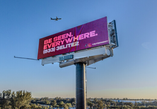
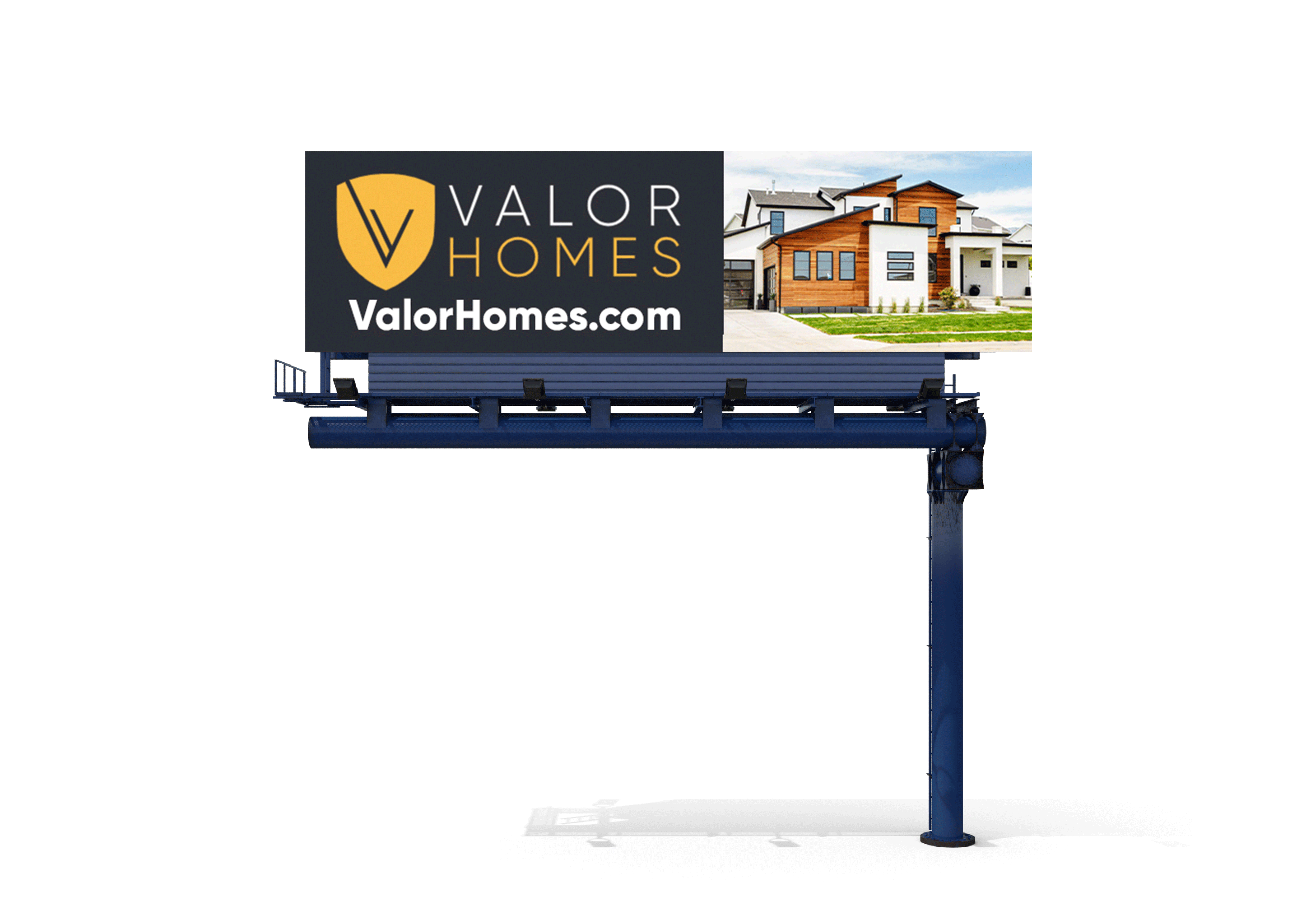
Because passersby will only have a few seconds to consume your ad, high-contrasting colors work really well to grab attention and make your ad clear. The contrasting colors in this example from Valor Homes emphasize the message and the call to action.
Bold and Clear Fonts
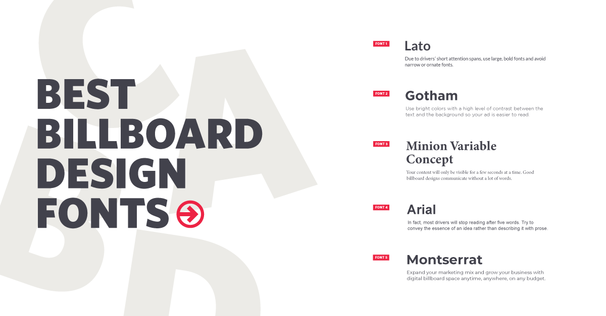
Similar to contrasting colors, clear, easy-to-read fonts make it possible for individuals to easily read and consume your message. Here are our graphic designer’s favorite fonts to use on billboard ads:
Short and Memorable Messaging
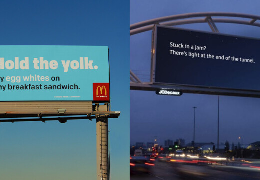
Complex visuals and industry jargon may confuse your audience – especially when they only have a few seconds to absorb your ad. Having less than 7-10 words ensures your billboard messaging is short and to the point.
When designing your billboard, you need messaging that will resonate with your audience. A creative campaign is memorable. But, don’t be so clever that your message isn’t clear. And, don’t be so clear that your ad isn’t memorable.
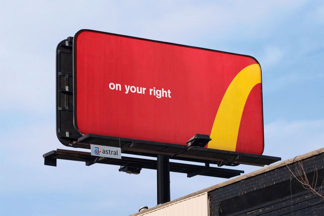
McDonald’s for example does a great job of creating simple yet memorable messaging on their billboard ads. This directional ad uses creative branding and messaging to create a clear call to action.
Images and Graphics
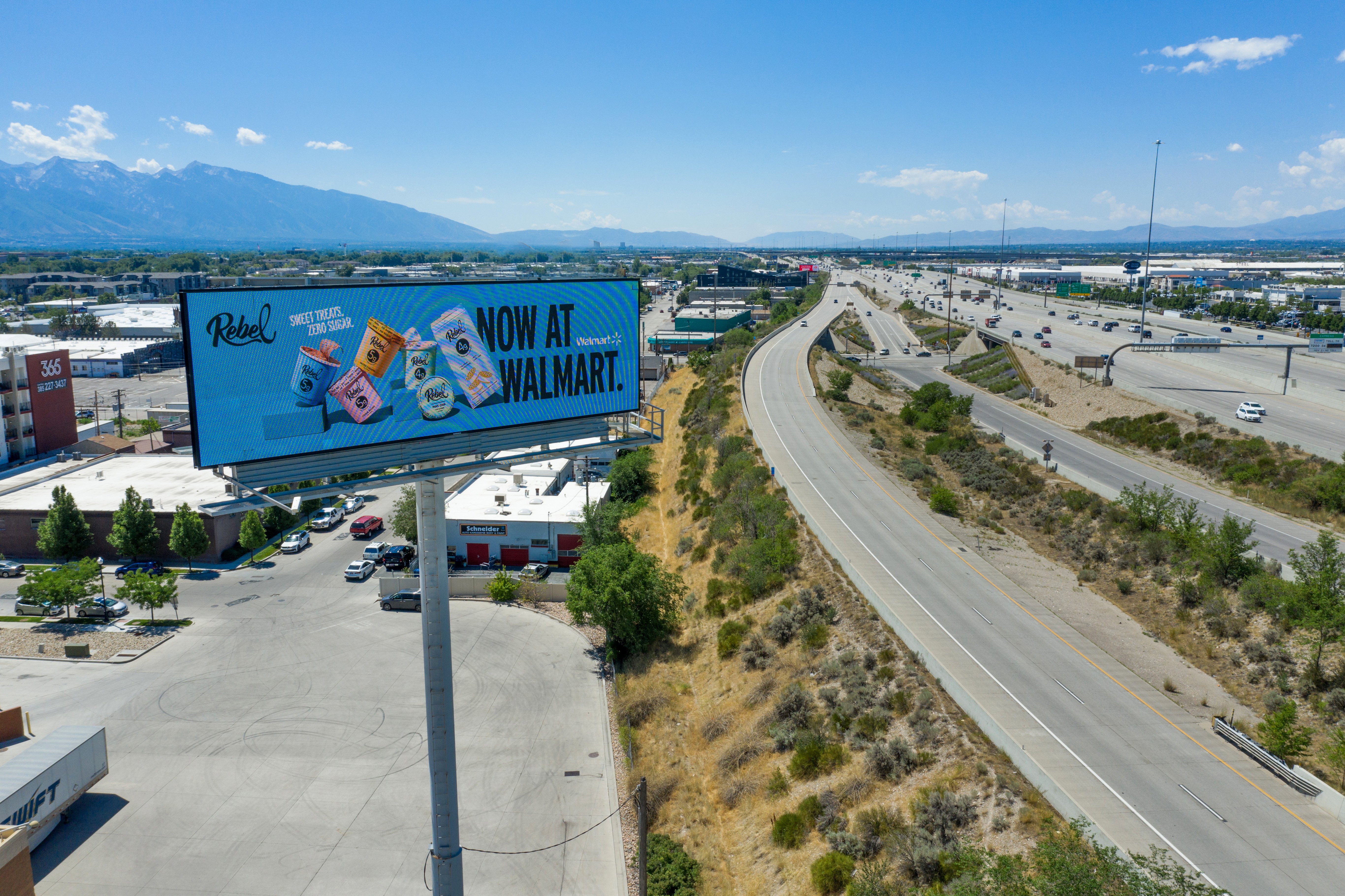
Including one image or graphic in your design is a great way to help tell a story and supplement your message. This design from Rebel Creamery is a perfect example of using short messaging and supplementing it with an image. The ad establishes brand recognition while grabbing attention.
What Doesn’t Work
Now that you know what elements to include in your billboard design, let’s discuss a few elements that won’t work on your billboard creative.
Yes or No Questions
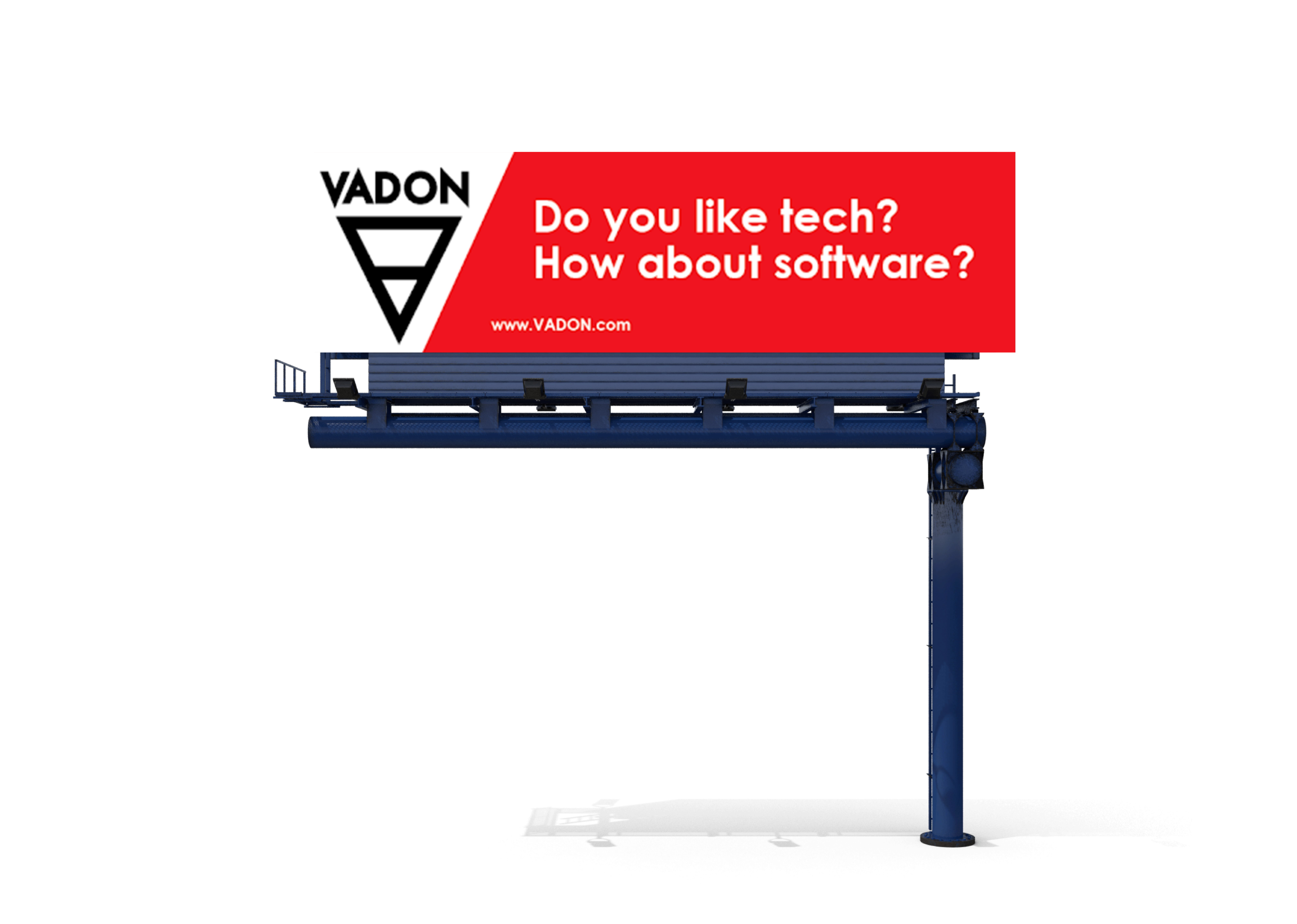
Avoid asking a question where someone could answer “No”. If you are asking a question, make sure it’s an open-ended question that will spark interest!
Redundancy
Try to avoid being redundant. For example, if your URL or social media handles are the same as your business’ name, you do not need to repeat it more than once. This will help limit the number of words on your design and make it easier to read.
QR Codes
Unless you are advertising on Blip’s Times Square board, adding QR or text codes is discouraged. These can distract drivers and encourage the use of phones while driving.
Fine Print
Skip the fine print. The information will get lost and may even detract from the main purpose of your ad. It’s best to save the fine print for your brochures and website!
_____
Hopefully, these examples and tips help you as you design your next billboard advertisement! For more helpful tips and to review Blip’s design guidelines, click here.
If you’re interested in receiving free billboard designs from Blip’s Design Team, our Advertising Plans are the perfect option. By signing up for a plan, you get access to free billboard designs, ensuring your ad creative will include all the elements that make up a quality design! You can learn more about our advertising plans here.
