Want your digital ads to stand out? Whether you’re designing for indoor or outdoor screens, scaling your content correctly is key. Here’s what you need to know:
- Indoor screens: High resolution, fine details, and moderate brightness (800–2,000 nits). Perfect for close-range viewing.
- Outdoor screens: Brightness is king (4,000–6,000 nits), with bold, simple designs for long-distance visibility.
Quick Comparison
| Feature | Indoor Displays | Outdoor Displays |
|---|---|---|
| Brightness | 800–2,000 nits | 4,000–6,000 nits |
| Pixel Pitch | 1.2mm–1.5mm | 6mm–10mm |
| Viewing Distance | Close range | Greater distances |
| Environmental Durability | Basic protection | Weatherproof (IP65/IP67) |
To make your designs pop:
- Use vector graphics for sharp visuals.
- Follow the 3×5 rule: Limit text to 3 lines of 5 words or 5 lines of 3 words.
- Choose the right aspect ratio: 16:9 for horizontal screens, 9:16 for vertical.
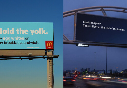
For outdoor screens, prioritize high contrast and simple messaging. Indoor designs can include finer details and subtle colors.
Blip‘s tools make scaling easy, offering templates, previews, and real-time bidding for ad placement starting at $20/day.
Keep it simple, bold, and tailored to the environment – your audience (and your ROI) will thank you.
Screen Scaling Basics
Resolution and Pixel Density
When it comes to displays, resolution and pixel density play a huge role in how content looks. Higher pixel density means sharper, clearer images, but it’s important to align this with the intended viewing distance. For instance, outdoor screens are typically viewed from farther away, so their pixel density doesn’t need to be as high as indoor displays. The key is ensuring that the pixel density (measured in PPI) matches the distance at which viewers will engage with the screen. Always design at the screen’s native resolution to avoid scaling issues or blurry visuals. Now, let’s dive into the most commonly used aspect ratios for creating well-fitted content.
Common Aspect Ratios
Aspect ratios determine how content fits on a screen, and choosing the right one ensures your visuals look clean and undistorted. Here are some of the most common aspect ratios and their typical applications:
| Aspect Ratio | Best Use Cases | Typical Applications |
|---|---|---|
| 16:9 | Horizontal displays | Highway billboards, lobby screens |
| 9:16 | Vertical displays | Mall directories, retail windows |
| 1:1 | Square formats | Social media content, menu boards |
| 4:3 | Traditional displays | Point-of-sale screens |
| 21:9 | Ultra-wide formats | Panoramic displays, video walls |
Picking the proper aspect ratio ensures your content looks polished and avoids awkward stretching or cropping.
Text and Image Size Rules
Once you’ve set the resolution and aspect ratio, the next step is optimizing text and image sizes for maximum impact. Here are a few key tips:
- Keep text legible: Choose sizes that are easy to read from the intended viewing distance, and ensure high contrast between the text and background.
- Use vector graphics: This ensures images stay crisp and clear, no matter how much you scale them.
- Follow a grid system: This helps maintain a clean layout, keeping important elements visible and well-positioned.
Poor optimization can hurt engagement by as much as 20%. On the flip side, responsive designs tailored to screen specifications can boost viewer retention by up to 35%. Paying attention to these details makes a big difference in how effectively your content connects with its audience.
How to Resize an Image for Large Prints
Indoor vs. Outdoor Screen Requirements
When designing digital displays, the environment plays a key role in determining the specifications and content approach.
Indoor Screen Specs
Indoor digital displays operate in controlled settings, which allows for precise content delivery. Here’s a breakdown of key specifications:
| Feature | Specification | Impact on Content |
|---|---|---|
| Brightness | 300–700 nits | Subtle color variations are visible. |
| Pixel Pitch | 1–3 mm | Fine details and smaller text are clear. |
| Viewing Distance | 7–10 feet | Supports intricate layouts. |
| Resolution | 1080p to 4K | High-detail graphics are achievable. |
To calculate the ideal viewing distance for an indoor screen, multiply the pixel pitch (in millimeters) by 10. For instance, a 2 mm pixel pitch suggests a viewing distance of about 20 feet. To further enhance visibility, reduce glare by positioning the screen strategically and ensure high contrast between text and background.
These specifications highlight the need to design content that aligns with the screen’s native resolution and optimal viewing metrics.
Outdoor Screen Specs
Outdoor screens face tougher conditions, demanding more robust specifications to ensure visibility and durability. Here’s what makes them stand out:
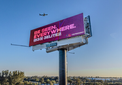
- Brightness: Ranges from 2,500 to 7,000 nits to remain visible under direct sunlight.
- Pixel Pitch: Between 6–16 mm, suitable for longer viewing distances.
- Graphics: Simplified designs for quick comprehension.
To enhance outdoor visibility, follow the 60–30–10 color rule:
- 60% for the dominant color
- 30% for the secondary color
- 10% for accent details
For peak performance in daylight, maintain a brightness of at least 2,500 nits and use strong contrast. With attention spans averaging just 8 seconds, it’s essential to prioritize clear, bold designs. Sans-serif fonts and high contrast ratios ensure text remains legible, even in challenging conditions.
Another useful guideline is the 3×5 text rule: limit your content to three lines of five words or five lines of three words. This keeps messaging concise and easy to digest at a glance.
sbb-itb-2e2e93f
Design Tips for Screen Scaling
Creating ads that look great on screens of all sizes requires a mix of technical know-how and smart design. Beyond the technical details, these tips will help you fine-tune your designs for the best possible display.
Why Vector Graphics Shine
Vector graphics are a designer’s best friend when it comes to scaling. Since they use mathematical formulas to create shapes, they stay sharp and clear no matter the size. Here’s why they’re a go-to choice:
- They ensure logos, icons, and text look sharp on any screen.
- You can skip creating multiple asset versions for different display sizes – one file does it all.
Designing Flexible Layouts
A flexible, modular layout makes it easier to adapt designs to different screen sizes while keeping the visual hierarchy intact. Here are two key strategies:
- Focus on a central element to draw attention to your main message.
- Use the 60-30-10 color rule: dedicate 60% to a dominant color, 30% to a secondary color, and 10% to an accent color. This keeps the design balanced and easy to read.
These techniques work hand in hand with technical specs to ensure your designs stay consistent across various screens.
Respecting Content Safe Areas
Always leave some breathing room for your design by keeping critical elements 5–10% away from the edges of the screen. This is especially important for large digital billboards, which come in a range of sizes – from 8×16 feet to 14×48 feet. Testing your design on different displays is crucial to make sure key visuals and messages stay visible. For reference, standard electronic signage is often around 10 feet high by 22 feet wide, though actual dimensions can vary.
Blip‘s Screen Scaling Tools
Blip makes it easier for advertisers to manage and optimize digital screen content. With features designed to maintain visual impact across different display formats, the platform simplifies the process from start to finish.
Screen Location Selection
Blip’s interactive marketplace is packed with tools to help you pick the best screen locations for your campaign. Each billboard comes with detailed metrics, including:
- Daily impression counts: See how many people view the screen each day.
- Cost per thousand impressions (CPM): Understand the cost-effectiveness of your ad placement.
- Traffic patterns: Analyze peak times and flow to target the right audience.
- Geographic targeting options: Ensure your ads appear in the areas that matter most to your brand.
With these insights, advertisers can balance impact and cost effectively. Once you’ve chosen your locations, Blip’s design tools make it easy to adapt your content for different screens.
Design Standards and Tools
Blip simplifies the design process with tools and resources that ensure your content looks great on any screen. Here’s what the platform offers:
| Feature | Purpose | Benefit |
|---|---|---|
| Design Templates | Pre-set dimensions for common sizes | Keeps your designs proportional |
| Grid Overlays | Guides for content placement | Ensures key elements stay visible |
| Preview Tool | Simulates how ads look on screens | Helps spot scaling issues early |
| Safe Zone Markers | Highlights optimal placement areas | Improves readability across formats |
Blip also ensures a quick turnaround, with most designs reviewed for quality and compliance within 1-3 days. Following the 3×5 rule, the platform encourages concise, easy-to-read text for maximum impact.
Pricing and Bidding System
Blip’s real-time bidding system updates every 10 minutes, creating a dynamic marketplace that keeps campaigns competitive across screen types. The pay-per-play model offers several advantages:
- Start with as little as $20/day.
- No long-term contracts – advertisers stay in control.
- Adjust bids to match real-time demand.
- Scale campaigns gradually to suit your budget.
“It’s not a social media thing that you see on your phone. It’s not word-of-mouth. It’s big and bold and out there in public. I would say this is the first step of looking big and public”.
Blip’s analytics dashboard takes it a step further, offering real-time performance tracking. Advertisers can monitor how their content performs across different screen formats and tweak campaigns instantly for better results.
Summary
As highlighted earlier, creating effective digital displays requires a tailored approach for indoor and outdoor environments. Here’s a quick breakdown of the main differences:
| Environment | Key Focus | Design Approach |
|---|---|---|
| Indoor Screens | Fine details, subtle colors | Precise, refined designs |
| Outdoor Screens | High visibility, durability | Bold, simplified messaging |
To ensure clarity and legibility, follow these essential guidelines: use vector graphics to maintain quality across screen sizes and opt for high-contrast color schemes to enhance readability under different lighting conditions. With the average viewer’s attention span lasting just 8 seconds, delivering clear and concise messages is more important than ever.
Blip’s Screen Scaling Tools make campaign optimization easier by combining automation with step-by-step guidance. Real-time bidding updates every 10 minutes, and campaigns start at just $20 per day, allowing you to test content efficiently across various display formats. The moderation process is straightforward: an initial review is completed within 90 minutes, followed by owner approval within 1–3 days, ensuring quick yet thorough quality checks.
When designing for digital displays, prioritize simplicity and impact by focusing on:
- Sans-serif fonts at the largest possible size
- Strong contrast ratios for better visibility
- Clear, engaging imagery
- Strategic use of negative space to avoid clutter
FAQs
What’s the difference between designing for indoor and outdoor digital screens?
When creating content for indoor digital screens, prioritize high resolution and precise color accuracy. These features ensure that visuals appear crisp and vibrant, especially in controlled lighting environments. Since viewers are typically closer to these displays, you can incorporate intricate details and subtle design elements without sacrificing clarity.
For outdoor digital screens, the approach shifts significantly. These displays need high brightness and strong contrast to stay visible under direct sunlight and various weather conditions. Designs should be straightforward and impactful, using bold visuals, large text, and minimal details to maintain readability from a distance. Additionally, durability is crucial – materials and designs must endure exposure to rain, wind, and temperature fluctuations.
What is pixel pitch, and why is it important to choose the right one for your digital display?
Pixel pitch is the measurement of the distance between the centers of two neighboring pixels on a digital screen. It’s a critical factor in determining how sharp and clear the display appears. Smaller pixel pitches mean the pixels are packed closer together, creating a higher pixel density. This results in sharper, more detailed images, which is perfect for screens meant to be viewed up close. On the flip side, larger pixel pitches are better suited for outdoor displays or screens meant to be seen from a distance, where fine detail isn’t as important.
Selecting the right pixel pitch is all about matching the screen to its intended viewing distance. A well-chosen pixel pitch ensures content looks crisp up close without pixelation and remains clear and easy to read from far away, enhancing the overall visual experience and keeping your audience engaged.
Why are vector graphics important for maintaining clear visuals on digital screens of all sizes?
Vector graphics play a key role in delivering crisp and clear visuals because they don’t rely on resolution. Unlike raster images, which can blur or pixelate when resized, vector graphics use mathematical equations to maintain sharpness and clarity at any scale. Whether it’s a small smartphone screen or a massive outdoor billboard, these graphics adjust seamlessly without losing quality.
This scalability makes vector graphics perfect for digital displays of all sizes. From indoor screens to outdoor advertising, they ensure your designs stay sharp and professional, giving your campaigns a polished and consistent appearance.