Webinar Recap: How to Grab Attention with Your Billboard: Design Best Practices
Seeing is believing.
For customers to know you exist, they need to see it – and for them to believe you could be the answer to their problem, what they see has to matter.
That presents a stellar opportunity for out-of-home digital billboard advertising to capture attention with stunning, can’t-miss designs.
To help, Blip held a webinar on grabbing attention with your digital billboard campaign by taking advantage of design best practices.
Our esteemed panel consisted of Andy Rocker (Director of Customer Success & Support, Blip) and Melody Roberts (owner and Chief Creative Officer of Out of Home Creative).
Here’s a quick overview of what we discussed:
- What NOT to do with your billboard design
- How to handle logos and imagery
- Print vs Out of Home
- The importance of location
- How to incorporate QR and text codes into your design
- Understanding just how impactful digital billboards can be to a marketing strategy
On to the recap!
Common Billboard Design Mistakes to Avoid
As Melody put it, “Out of home is advertising in its simplest form.” It’s all about branding – the instant visual impression your name, logo, and visuals make on people who see it.
This reality makes it easier to connect…but it also makes it easier to ruin the first impression.
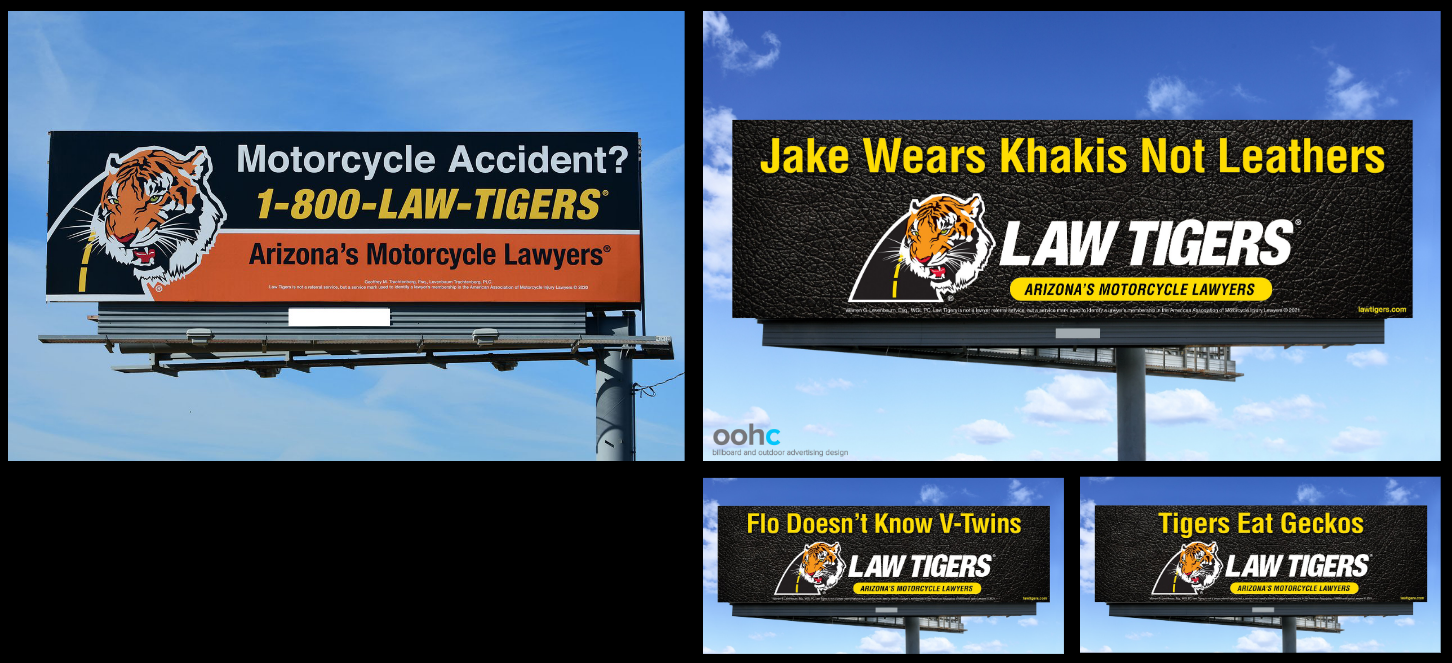
Melody used an example of a client’s attempt at designing their creative themselves to point out a few common pitfalls.
The things she pointed out that are examples of common mistakes include:
- Colors don’t contrast enough (red on pink)
- Too much copy
- Logos that are too small
- Busy, crowded design with too much going on
- Graphics that aren’t interesting, compelling, or exciting
- Promoting too many services
Another question that comes up is this: Is it necessary to put every city or town you serve on an OOH advertisement? Not if it adds too much to the ad and clutters up the space. To this point, Melody provided a stat from the American Academy of Advertising that said almost 50% of viewers research more specific information after seeing a billboard – and that includes location.
Melody then provided an example of designs her agency generated for another campaign for the same client. Take a look and notice the difference:
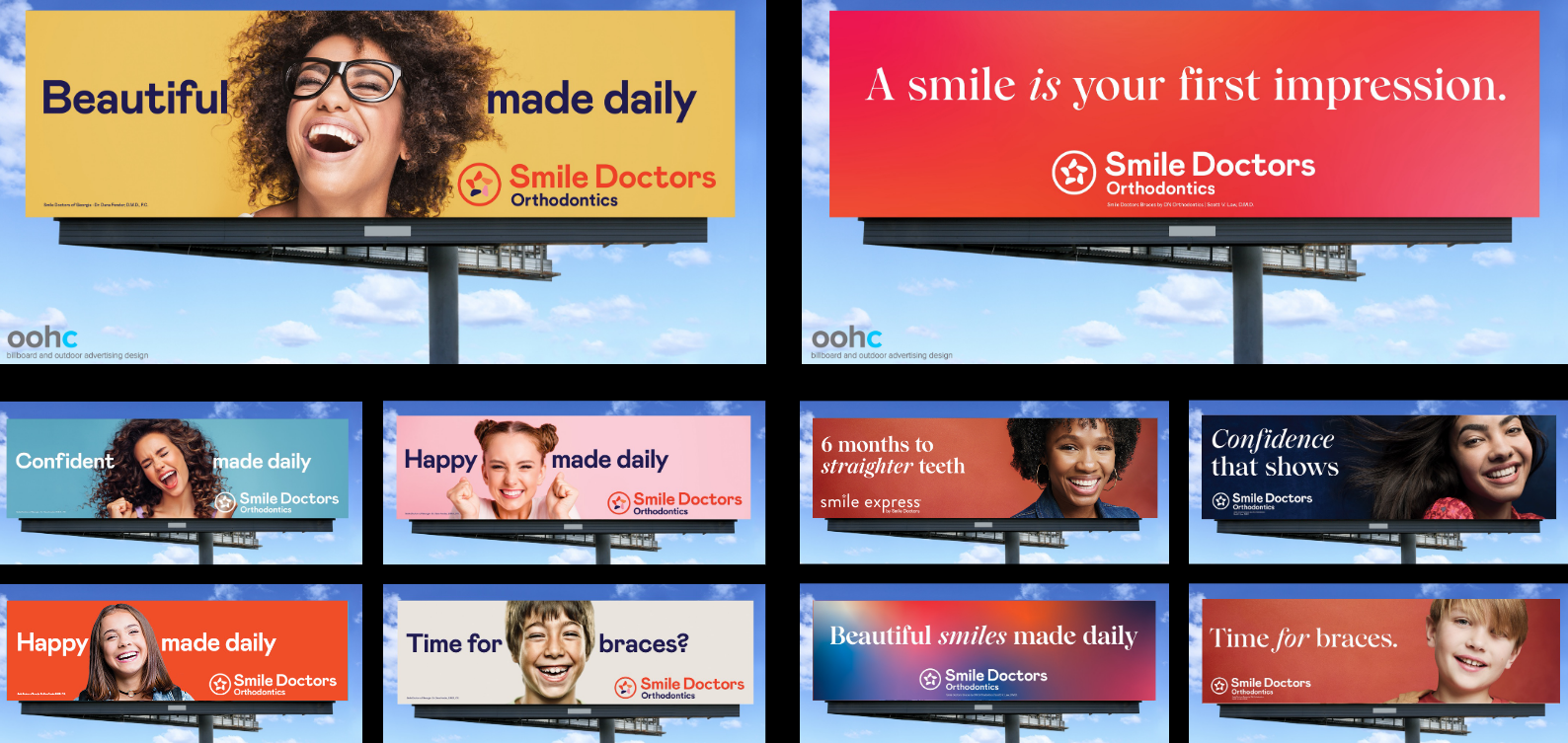
In this campaign:
- Colors contrast properly
- Copy is concise and kept to a minimum
- The logo is big enough to be noticed
- The design isn’t crowded or too busy
- Graphics catch the eye and are more compelling
- Each ad focuses on only one service
An advantage of digital out-of-home advertising is that you can create multiple ads for different combinations of services and locations without blowing up your budget.
You can also have a lot of fun with color, as Melody points out; color can be more vivid and eye-catching than it can be with a static print campaign, especially with gradients and animations.
Above all, try to show more than you tell. OOH advertising is a visual medium first and foremost. It’s also an emotional medium; 76% of decision-making is based on emotions, according to AAA.
Avoid these common mistakes, and your design will be stronger and more influential.
How to Handle Logos and Imagery
Choosing the right images and incorporating them with your logo in the right way may look simple if it’s done correctly – but it’s not easy.
Finding the right graphics can take hours of research and editing to get just right. Logos can also be a chore to recolor, resize, rearrange, or otherwise redesign so that they stand out, but don’t take over the design completely.
Additionally, logos are hard to recognize from a distance unless they’re very memorable, like Coca-Cola. As Melody put it, business logos just aren’t made for out-of-home advertising.
To help, Melody explained principles that make finding and using graphics easier than ever, starting with a client campaign for a farm market.
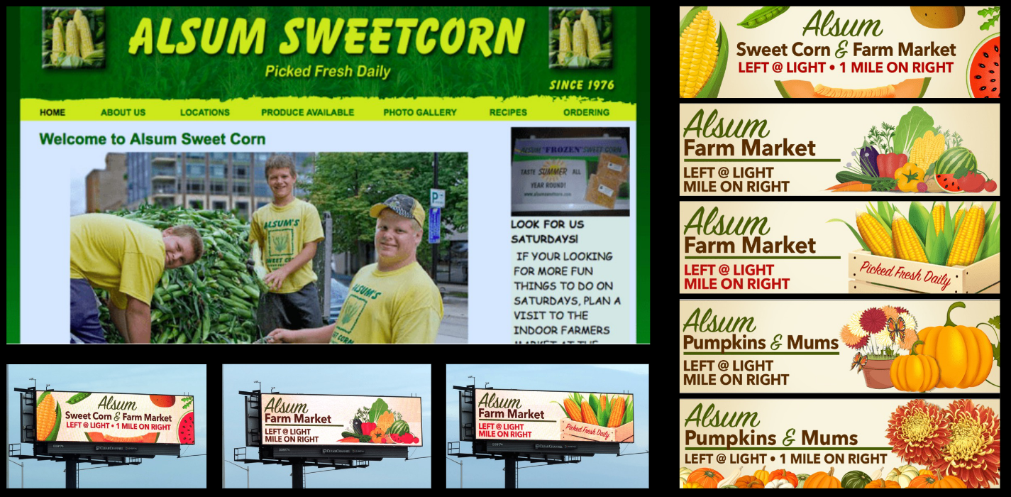
The first thing Melody pointed out about this campaign was the importance of selling the product. She wanted to move away from showcasing the workers and more on what would be a “paper bag” moment: the thing that would make people want to pull over and buy.
Melody also wanted to take advantage of the flexibility that digital affords. The images she pulled focused on individual products (corn, pumpkins, flowers, etc.) that could then be rotated on a digital billboard.
That way, each image gets the chance to sell the product and stand out without all the clutter.
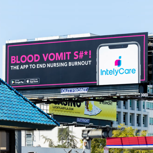
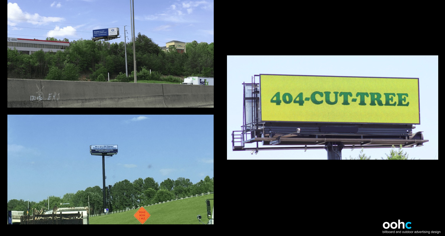
Another example of imagery and how to use it came with a campaign for hiring medical workers. The boards on the left contained too much information on a white background.
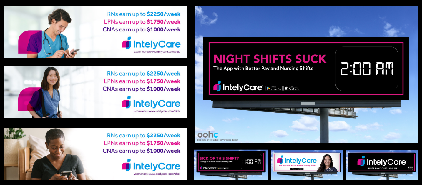
What’s wrong with a white background? As Melody explained, white backgrounds don’t work well for digital because it’s jarring and hard to re-focus on when the digital screen switches from a colorful ad.
If you’re going to use white, you can mix it with a soft gradient into gray, or add 8-10% black so it’s not so stark.
Per the above example, images – especially of people – need to be identifiable. Melody advised staying away from pictures of people looking down (since it can be harder to tell what’s going on from a moving vehicle) or people who are turned away from the camera.
You also generally want to keep copy on the left and the image on the right (although Melody isn’t rigid on that principle). People read left to right. They also scan from left to right. When digital screens change, that’s the natural pattern, and copy on the left makes the message easier to find.
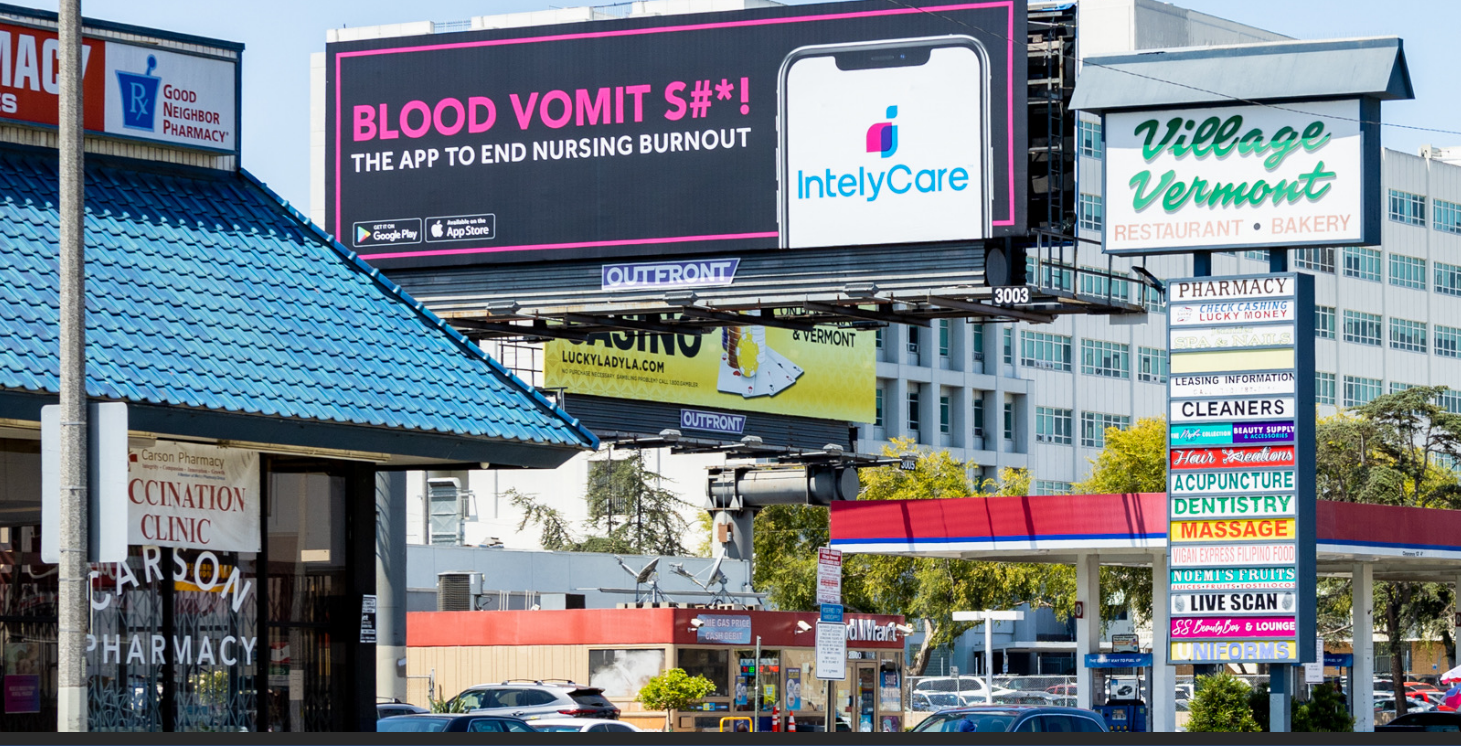
(By the way, here’s the above ad in the wild, in Los Angeles.)
Tying Digital Billboard Advertising to Your Overall Marketing Strategy
Digital out-of-home advertising is great, but it’s not the only way to advertise, nor should it be.
The beauty of digital billboard advertising is that it can be incorporated seamlessly into your overall marketing strategy, especially by giving you the flexibility to:
- Spread a theme or message across multiple screens, thereby giving each part of the theme a special focus
- Target precisely by location and make the broad strategy local
- Drive online search by putting the brand top-of-mind
- Track activity through text and QR codes
- Change creative every 60 days
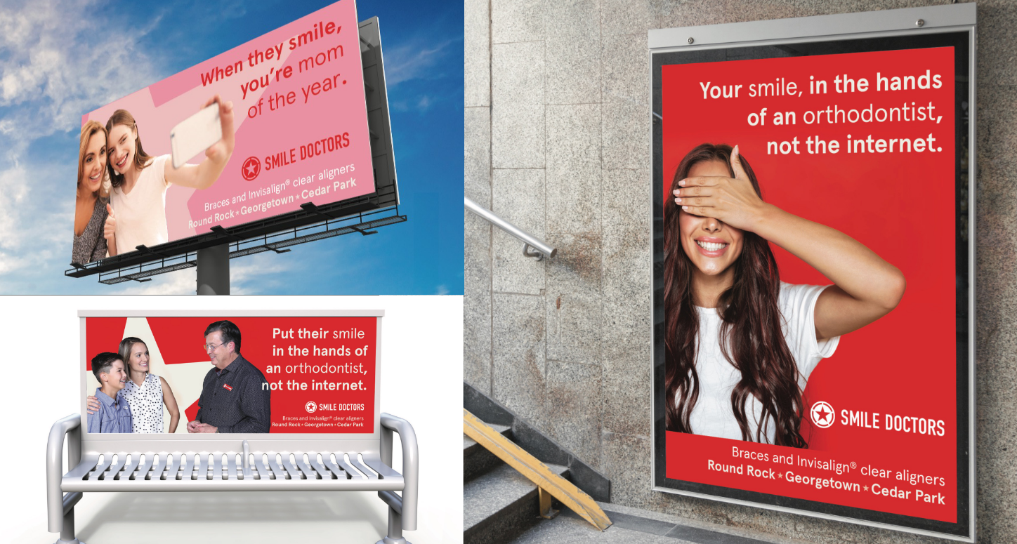
One example of how Melody stuck to their brand guidelines but was able to refresh the message from what they had been using consistently is below:
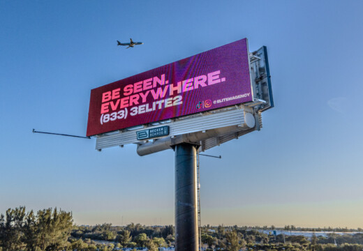
Melody chose to focus on the headline and promote the brand as a whole, but she mentioned that if you want to use a phone number (as the original campaign on the left did), a vanity number isn’t a bad idea.
Any phone number or hashtag or text code needs to be memorable enough that people can easily remember it (because they’re hopefully not taking the time to jot it down while driving).
The example of how to use a phone number below isn’t as “sexy” as Melody would normally like to create, but you can’t argue about its simple effectiveness:\
(And you can actually see it, versus the two actual billboards on the left.)
Ultimately, if you want a jaw-dropping billboard, keep design:
- Simple and uncluttered
- Easy to see and read
- Focused on emotion
If you want to see more examples – or get easy-to-use templates for your own campaign – be sure to visit our Blip marketplace. Your next stunning digital billboard campaign is just a few clicks away.