Digital billboards are all about grabbing attention. But did you know that the size of the screen and viewing distance can make or break your ad’s impact? Here’s what you need to know:
- Viewing Distance: Text size matters. Use 1 inch of letter height for every 10 feet of viewing distance.
- Screen Dimensions: Common sizes include 14′ x 48′ (highways) and 10′ x 30′ (urban areas). Design for the specific screen size to ensure clarity.
- Resolution: Match your design resolution to the screen’s specs (e.g., 16mm pixel pitch for highways, 6-10mm for urban displays).
- Text and Image Tips: Use bold fonts, high-resolution visuals, and maintain a 15% margin (safe zone) to avoid cropping.
- Tools: Platforms like Blip offer templates, previews, and analytics to help you create effective designs for multiple formats.
Key takeaway: Screen size impacts text readability, layout, and brand visibility. Start with the largest resolution, test across formats, and focus on simplicity to ensure your ad works wherever it’s displayed.
How to Figure Document Size for a Billboard in Adobe InDesign – Scale Ratio or Scale Factor
Digital Billboard Screen Size Basics
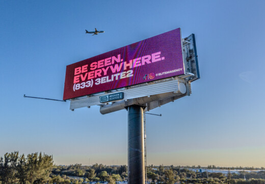
Grasping the dimensions of digital billboards is key to designing ads that stand out. In the U.S., the outdoor advertising industry relies on standardized sizes to ensure visibility and effectiveness across various viewing scenarios.
Common Sizes
The most prevalent digital billboard size in the U.S. is the 14′ x 48′ bulletin board, which makes up 72% of highway installations. These large displays are perfect for grabbing attention from long distances. In urban areas, smaller 10′ x 30′ displays are more common, offering excellent visibility in tighter spaces.
Here’s a quick breakdown of popular digital billboard formats:
| Display Type | Dimensions | Typical Usage | Optimal Content |
|---|---|---|---|
| Highway Bulletin | 14′ x 48′ | Interstate/Major Roads | Panoramic imagery, brand campaigns |
| Urban Display | 10′ x 30′ | City Centers/Main Streets | Location-specific messaging |
| Premium Display | 10.5′ x 36′ | High-Traffic Urban Areas | Mixed media content |
Each size has specific resolution requirements to ensure the content appears sharp and professional.
Resolution Requirements
Once the dimensions are set, the next step is meeting the technical specs for each display type. For instance, a 14′ x 48′ billboard typically uses around 146,261 pixels with a 16mm pixel pitch, which ensures it’s clear and readable from highways. Here are some key resolution details:
- Highway Bulletins: Use a 16mm pixel pitch, ideal for long-distance viewing.
- Urban Displays: Require a finer 6-10mm pixel pitch for closer viewing.
- Artwork Files: A 10′ x 30′ display design should meet a minimum resolution of 1,000 x 3,000 pixels.
Distance and Visibility
Size and resolution are only part of the equation – how far viewers are from the billboard also impacts the design. A general rule is to use 1 inch of letter height for every 10 feet of viewing distance. For example, text on a highway bulletin viewed from 500 feet should be about 24 inches tall to stay legible.
Other factors to keep in mind:
- Brightness Levels: Highway displays need brightness between 6,000 and 8,000 nits for daytime clarity.
- Text Sizing: Urban displays viewed from 150 feet typically require letters at least 4 inches tall.
- Safe Zones: Leave a 15% margin on all sides of the ad to ensure nothing important gets cut off.
These guidelines help create ads that not only look great but also communicate effectively, no matter the setting or distance.
Screen Size Design Problems
When it comes to billboard ads, screen size can be a tricky obstacle. Ensuring the message stays clear and engaging across different dimensions requires careful attention, especially when it comes to text. Let’s dive into some common challenges designers face with text size in billboard design.
Text Size Issues
Creating text that’s easy to read across various screen sizes isn’t as simple as it sounds. Here are some common pitfalls:
- Scaling Problems: A font that looks perfect on one screen might turn into a blurry mess or become too small to read on another.
- Font Weight Dilemmas: Fonts that work beautifully on smaller screens can feel overly bold or clunky when scaled up for larger displays.
- Line Spacing Snags: Poorly adjusted spacing between lines can make text harder to follow, especially from a distance.
One major mistake? Relying solely on desktop previews. Designing on a 27-inch monitor doesn’t account for how people actually view billboards – often from far away and at different angles. This disconnect can lead to design proportions that just don’t translate well in the real world.
sbb-itb-2e2e93f
Screen Size Design Solutions
Tackling screen size challenges starts with practical design strategies that ensure your ad remains eye-catching and easy to read, no matter the display.
Text and Image Sizing
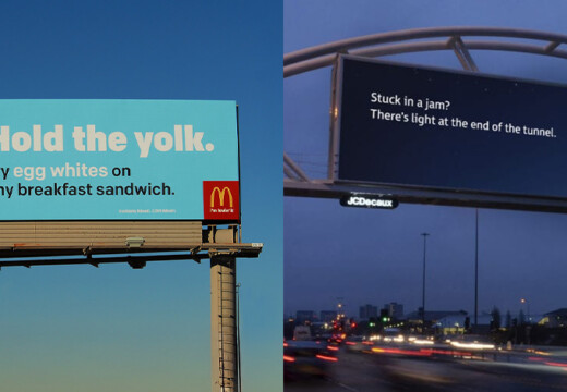
Make sure your text and images are scaled for clarity, considering typical viewing distances. Opt for bold, easy-to-read fonts and crisp, high-resolution visuals. Adjust your layout to fit the screen dimensions and how far your audience is likely to be from the display.
Multi-Format Design Tips
Designing for multiple formats requires a thoughtful approach. Here’s how to make your designs work across various screen sizes:
- Begin with the largest resolution your ad will need.
- Use vector graphics to maintain sharpness when scaling.
- Keep essential content within a “safe zone” to avoid cropping.
- Test your design across both the smallest and largest display sizes to ensure consistency.
Blip Design Resources
Blip simplifies the process of creating billboard ads that work across different formats. Their tools and resources include:
- Tutorials and pre-sized templates to guide your design process.
- Real-time previews that show how your ad will look on various screens.
- A fast design review process, helping you launch campaigns quickly.
Digital Tools for Multiple Screens
Handling billboard designs for various screen sizes has become easier thanks to digital tools. Platforms like Blip make it possible to test and fine-tune ad displays across multiple formats.
Blip Pricing and Performance
Blip uses a pay-per-play system that brings flexibility to multi-screen campaigns. Ads are placed through real-time bidding every 10 minutes, ensuring efficient use of your budget. This dynamic pricing approach allows advertisers to manage costs effectively while delivering ads across different billboard sizes and locations.
Design Testing Tools
Blip’s analytics tools help evaluate how your ads perform on different screens. They identify issues like resolution or visibility problems, enabling quick adjustments based on data. This means you can make informed decisions and manage your advertising budget more effectively.
Cost-Effective Campaign Setup
With Blip, advertisers can experiment with various design options tailored to different screen dimensions without breaking the bank. The platform’s detailed analytics ensure that your designs are not only eye-catching but also deliver results.
| Screen Type | Minimum Daily Budget | Approval Time |
|---|---|---|
| Standard Digital | $20 | 90 minutes |
| Large Format | $20 | 90 minutes |
| Premium Location | $20 | 1-3 days |
Conclusion
The size of a screen plays a key role in shaping billboard ad design. Factors like format, visibility, and technical considerations are all critical. As Chris Leslie, Founder of Leslie Lightcraft Co, puts it:
“It’s not a social media thing that you see on your phone. It’s not word-of-mouth. It’s big and bold and out there in public. I would say this is the first step of looking big and public”.
Blip’s design tools and analytics make it easier for advertisers to adapt content across digital billboard formats. These tools help create striking campaigns while offering real-time performance tracking. By focusing on thoughtful design strategies, advertisers can amplify visual appeal and achieve measurable results.
The impact of screen-optimized designs is clear from real-world examples. Ray Bowens, Founder of Hashtag-Vape, shares:
“Billboards are one of the most impactful ways to advertise, and with Blip, you spend a fraction of what you would end up paying elsewhere”.
This affordability has redefined outdoor advertising, giving businesses the chance to create screen-optimized campaigns that increase visibility and fuel growth across various locations.
FAQs
What is the best text size for a billboard based on viewing distance?
When it comes to billboards, the size of your text plays a crucial role in how easily it can be read from a distance. Here’s a simple guideline: for every 10 feet of viewing distance, your text should be at least 1 inch tall. So, if your billboard is meant to be read from 300 feet away, the letters need to be a minimum of 30 inches high for optimal readability.
In addition to text size, choosing bold, uncomplicated fonts and pairing them with high-contrast colors can make a big difference. These design choices ensure your message grabs attention and remains legible, even from afar.
How does Blip make it easier to design effective billboard ads for different screen sizes?
Blip makes designing billboard ads a breeze, ensuring they look fantastic on screens of all sizes. Their user-friendly, self-serve platform comes equipped with step-by-step guides and design tips, helping advertisers create content that’s clear, eye-catching, and effective – no matter the billboard’s dimensions.
Beyond design, Blip offers powerful tools to streamline the entire advertising process. Features like an interactive marketplace let users choose billboard locations with ease, while real-time bidding helps keep costs manageable. Plus, detailed analytics allow advertisers to monitor their campaign’s performance. With these tools, Blip takes the hassle out of outdoor advertising, offering flexible and budget-conscious solutions for brands of all sizes.
How can I design a billboard ad that looks great on different screen sizes and resolutions?
To make sure your billboard ad grabs attention across all screen sizes and resolutions, keep it simple and clear. Use bold, easy-to-read fonts paired with high-contrast colors that pop, even on smaller or lower-quality screens. Stick to short messages – ideally 7 words or less – so your audience can quickly grasp your point as they pass by.
It’s also smart to design with adaptability in mind. Create visuals that work seamlessly in both horizontal and vertical layouts without losing their impact. Test your designs on various screen sizes to ensure they remain readable and visually appealing.
Platforms like Blip can help streamline this process. Their design tools and guidelines are tailored to optimize ads for digital billboards, making it easier for your campaign to stand out and look polished no matter where it’s displayed.
Related posts
- How to Choose Graphics for Digital Billboards
- Checklist for Quick-Read Billboard Designs
- How Screen Size Impacts Billboard Visibility
When it comes to billboards, the size of your text plays a crucial role in how easily it can be read from a distance. Here's a simple guideline: for every 10 feet of viewing distance, your text should be at least 1 inch tall. So, if your billboard is meant to be read from 300 feet away, the letters need to be a minimum of 30 inches high for optimal readability.
\n
In addition to text size, choosing bold, uncomplicated fonts and pairing them with high-contrast colors can make a big difference. These design choices ensure your message grabs attention and remains legible, even from afar.
"}},{"@type":"Question","name":"How does Blip make it easier to design effective billboard ads for different screen sizes?","acceptedAnswer":{"@type":"Answer","text":"
Blip makes designing billboard ads a breeze, ensuring they look fantastic on screens of all sizes. Their user-friendly, self-serve platform comes equipped with step-by-step guides and design tips, helping advertisers create content that's clear, eye-catching, and effective - no matter the billboard's dimensions.
\n
Beyond design, Blip offers powerful tools to streamline the entire advertising process. Features like an interactive marketplace let users choose billboard locations with ease, while real-time bidding helps keep costs manageable. Plus, detailed analytics allow advertisers to monitor their campaign's performance. With these tools, Blip takes the hassle out of outdoor advertising, offering flexible and budget-conscious solutions for brands of all sizes.
"}},{"@type":"Question","name":"How can I design a billboard ad that looks great on different screen sizes and resolutions?","acceptedAnswer":{"@type":"Answer","text":"
To make sure your billboard ad grabs attention across all screen sizes and resolutions, keep it simple and clear. Use bold, easy-to-read fonts paired with high-contrast colors that pop, even on smaller or lower-quality screens. Stick to short messages - ideally 7 words or less - so your audience can quickly grasp your point as they pass by.
\n
It’s also smart to design with adaptability in mind. Create visuals that work seamlessly in both horizontal and vertical layouts without losing their impact. Test your designs on various screen sizes to ensure they remain readable and visually appealing.
\n
Platforms like Blip can help streamline this process. Their design tools and guidelines are tailored to optimize ads for digital billboards, making it easier for your campaign to stand out and look polished no matter where it’s displayed.
"}}]}